

SwiftUI is the hottest topic in iOS Development. It is a declarative UI pattern written in Swift for app development in Apple devices. It allows us to write apps with syntax declarations and support hot reloading or live preview and many other feature sets which makes it easier to develop apps or implement features for future updates.
What is a Declarative UI?
“Declarative UI” means you describe in some kind of language what elements you need in your UI, and to some degree how they should look like, but you can leave out details like the exact position and visual style of the elements. For example, in HTML you can describe that you want an input field, but how and where this field will be placed in the UI is highly dependent on the browser you are using.
Today we’ll learn how we can build a simple Todo app for iOS.
Things you’ll need
- A computer running macOS
- Xcode
- Preferably, a physical iOS device or you can just use emulator
Things you’ll learn
- Creating views using SwiftUI
- Using SF Symbols for Images
- State management
- Extracting views for modularity
- Swipe to delete rows in a List view
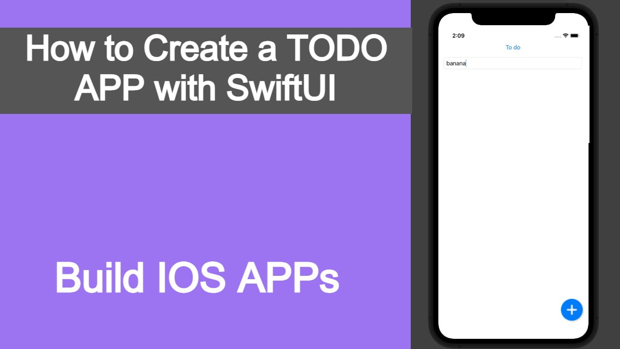
What you’ll build

Table of Contents
- SwiftUI views used in the project
- View Modifiers
- Starting a new SwiftUI project
- Creating an Apple Id
- Signing In with your Apple Id in Xcode
- Creating Text view
- Creating Data model class
- Extracting Sub-view
- Creating List view
- Creating Stacks
- Creating Button view
- Final code
Below are the SwiftUI views that we’ll use in this project
- Text(“Placeholder”) – As the name suggests, it adds a text view.
- Eg: Text(“Namaste”)
- TextField(title: StringProtocol, text: Binding<String>) – It adds a text input field. The placeholder text for the view is defined by the value passed in StringProtocol while the input value will be bound to the Binding variable.
- Eg:
@State var name: String = “”
TextField(“Username”,text: $name)
Here, we’ve used @State annotation which will be explained later in the article.
Spacer()– It is an empty field that is used to add space between different views.Button(action:{},label:{})– It is used to create a Button view. The action closure is called when certain actions are performed on the Button. The label closure describes the style of the Button label.- Stacks: There are 3 stack views in SwiftUI. The order on how the views inside will be displayed is always from top to bottom(for ZStack the top layer is always the bottom most layer and vice-versa).
HStack {}– Stacks view horizontallyVStack {}– Stacks view verticallyZStack {}– Stacks view in the z-index i.e. on top of each other
List {}– It is used to create a list of elements.Image()– It is used to add an image view.
There are two ways to add Views, either we can manually write the initialization code or we can click on the library icon, search the required view and then drag the view to where it is needed.

There are different types of modifiers that we can add to each view to customize the view according to our needs. This is one of the ways that SwiftUI makes building UI’s easier as the views can share properties between each other. Some of the most common modifiers are:
foregroundColor(.blue)– Sets the color for any view of the UI in the foregroundbackgroundColor(.blue)– Sets the color of any view of the UI in the backgroundpadding()– Adds a default padding for the view on all the edges( left, right, top, bottom ). We can also specify the edge or the amount of padding.shadow()– Adds shadow to the view. The type of shadow can be defined with color, color opacity, radius and the xy axis values.font()– It is the most common modifier used for text related fields. We can assign a custom font family or font size to the text using this modifier.frame()– It is most commonly used for Images. It is used to give custom values to image fields. Note: To make any image customizable, we need to assign the resizable() modifier to the view. Only then can other modifiers be applied.
Let’s start with creating a new Xcode project.
Open Xcode and select Start a new project. If it is already open, goto File > New > Project.

Select App under iOS tab and click Next.

Give a product name of your choosing. I named it Todo.
Select a team, If you don’t see anything listed. Follow the steps below.
- Create an apple id here
- After the apple id is created successfully, add your account to Xcode. Goto Xcode > Preferences > Accounts > Click on the + on the bottom left of the window.

- After logging in, close Xcode and open it again. On the project creation page, you should now see your name John Doe(Personal Team). For learning purposes, it is fine to use this account.
- Organization identifier – Following convention, you can give it your name with a prefix(com.) and a suffix at the end. The whole reason for an identifier is to make sure that the app is unique. Using a personal developer account, you are only allotted a certain number of unique identifiers per week. If you are creating multiple apps using this account, you can use the same identifier(only do this for learning app development). Your identifier should look something like shown below:
- com.johndoe.app
- Select SwiftUI interface as we’re gonna be building a SwiftUI app.
- For Life Cycle, currently you’ll find two options: SwiftUi app and UIKit App Delegate. Choose UIKit App Delegate for now.
- Select language as Swift.
- Uncheck ‘Use Core Data’ if it is checked. We’ll not be using any data persistence for now.
Choose a folder to create your project at. I generally use a Workspace folder, where I store all my projects. Then, hit Create. If everything goes well, you should see the following structure on the left side of your Xcode window.

Xcode also automatically opens the ContentView.swift file that holds all your view information for now. If your canvas is active, you should see a live preview of how the app looks like. If not you can enable your canvas using the editor options.

Now, we can finally begin to write some code.
Step 1: In your ContentView.swift file, we are going to make some changes.
First, replace the default text that says “Hello World” with “To do”
Text("To do")
Now, we can add a modifier to change the color of the text. We add modifiers to views using dot operators(.) . Add .foregroundColor() modifier to change the text color to blue. Here, .blue is the predefined system color.
Text("To do").foregroundColor(.blue)
Note: foregroundColor() modifier will work differently depending on the view.
If you press Command + B to build the app and your canvas is open and not paused, a preview of the change will be visible.
Step 2: We now need a class that will be used to structure our data.
Create a new Swift file by right-clicking on your root project folder and selecting New File. Give it a name of Items and click create. This will be our Model.
struct Items {
let date = Date()
let data: String
}
In your Items.swift file, Create a new struct like so. Here, date is a computed field and it’s value will be initialized when an instance object from Items class is created. Whereas, data is a variable of type String and it’s value can be assigned upon initialization. Here both of the variables are constants denoted by let, which means once initialized the value is immutable i.e. it cannot be changed.
What is a computed property?
A computed property is a special feature which allows the value of the variable to be computed on the object initialization.
struct Ram {
    var food: String = "Mango"
    var likes: String {
        return "Ram likes \(food)"
    }
}

//Ram().likes returns "Ram likes Mango"
Step 3: Add a TextField that’ll be used to input our data.
First, we need to embed our Text view into a Vertical Stack or VStack. You can do this by creating a VStack { //sub-view } and adding your Text inside the VStack curly braces {}. But there’s an easy way to do this, Press Command and then left click the Text field.

Click on the line where it says Embed to VStack. This will work the same as mentioned above.
Before adding a TextField, we need a place to store the input value. For this we need to initialize a variable of type string. We’ll add a @State annotation on it, to signify that it’s state is being monitored and any change of the state will be reflected on all of it’s instances. It basically means that a change in it’s value will change all the places where it is being used.
@State var todoData:String = ""
We initialize the variable as empty. Note that empty is not equal to nil.
As to why we initialized it beforehand and not when we get the input data, we’ll need to talk about optionals which will be covered in a future article. We can now add the TextField view.
TextField("Things to do", text: $todoData)
.textFieldStyle(RoundedBorderTextFieldStyle())
.padding(10)
I’ve used two modifiers to make it look nicer. The RoundedBorderTextFieldStyle() will create rounded edges border around the TextField view. While padding(), is a generic padding modifier with some value.
Step 4: Creating the list view
First, Create an array of Items where we’ll store our data. This will also be state monitored.
@State var allItems = [Items]()
Since, we’re going to be placing a floating button above the list. We need a ZStack to layer them on top of each other.

Add a ZStack view below the TextField view inside the VStack.
Note: It’s helpful and easy to build UI if you keep the view hierarchy in mind, for our app we need:
- A root VStack for Text,TextField and List view.
- A ZStack to layer List view and Button view.
- Another VStack to bring the Button view to the bottom.
- A HStack to set the Button position to the bottom right of the screen.
Create a List view inside the ZStack like so,
List {
ForEach(self.allItems, id: \.date) { item in
Text(item.data)
}
.onDelete(perform: deleteItem)
}
Here, We’re using the ForEach function to loop over the Items array and showing the data for each array element in a Text view. We also have a .onDelete modifier for the List view which will facilitate us the feature of swipe to delete. We’ll delegate this action to a separate function inside our ContentView.
func deleteItem(at offSets: IndexSet) {
allItems.remove(atOffsets: offSets)
}
Button(action: {
    if (todoData != "") {
        self.allItems.append(Items(data: todoData))
        todoData = ""
    }
    UIApplication.shared.sendAction(#selector(UIResponder.resignFirstResponder), to: nil, from: nil, for: nil)
}, label: {
    Image(systemName: "plus.circle.fill")
        .resizable()
        .frame(width: 60, height: 60, alignment: .center)
        .padding()
})
.shadow(color: Color.black.opacity(0.2), radius: 2, x: 2, y: 2)
Here, when the button is pressed
- We check if the input value is empty, we should not add any values to the list if it is empty.
- If it is not empty then we can create a new data object from Items class using the input data.
- We then append the data to the global array of Items and reset the input field
- Instead of a text, we’ve used a SF Symbol image and added some modifiers to it
- We’ve also added shadow modifiers to the parent Button view
You can find more info on SF Symbols here.
You can download a macOS app to see all the available images.
We’re also tapping into the shared application singleton to dismiss the keyboard after data has been added. Just copy and paste this for now.
VStack {
    Spacer()
    HStack {
        Spacer()
        Button(action: {
            if (todoData != "") {
                self.allItems.append(Items(data: todoData))
                todoData = ""
            }
            UIApplication.shared.sendAction(#selector(UIResponder.resignFirstResponder), to: nil, from: nil, for: nil)
        }, label: {
            Image(systemName: "plus.circle.fill")
                .resizable()
                .frame(width: 60, height: 60, alignment: .center)
                .padding()
        })
        .shadow(color: Color.black.opacity(0.2), radius: 2, x: 2, y: 2)
    }
}
If you run this app now, you’ll find that it is working fine but the Button view is not appearing correctly. We can fix this by adding a VStack and a spacer, then adding a HStack and a spacer after which we will add the newly created Button view.
After this is complete, we now have a working SwiftUI application that stores data(not persistent), has a reactive view and supports swipe to delete.
But we can further refactor our app so that some functionalities can be delegated to different views or extensions to support modularity.
We can start by extracting our Button image sub-view. We can do this by holding
Command and left clicking the Image view and selecting ‘Extract Subview’.

Right click on the ExtractedView and refactor it to ‘ButtonImage’ or a name appropriate to the view. This method of modularity helps us extract sub-views to their own individual view and use the same code in different parts of the project but we must initialize the values that are being passed to the view. In our case, we’re passing the image name. So, we create a let constant in our extracted view called imageName.
struct ButtonImage: View {

    let imageName: String

    var body: some View {
        Image(systemName: imageName)
            .resizable()
            .frame(width: 60, height: 60, alignment: .center)
            .padding()
    }
}
We can then pass the image name directly to the extracted view.
ButtonImage(imageName: "plus.circle.fill")
We can also extend our View to support custom functions using “extension”. We’ll use this feature to extend our root View to support hideKeyboard functionality.
extension View {
    func hideKeyboard() {
        UIApplication.shared.sendAction(#selector(UIResponder.resignFirstResponder), to: nil, from: nil, for: nil)
    }
}
Paste the above code outside the ContentView. Then replace the code for keyboard hide with
hideKeyboard()
You should have something like this after
if (todoData != "") {
      self.allItems.append(Items(data: todoData))
      todoData = ""
}
hideKeyboard()
If you followed everything correctly, your final ContentView.swift should look something like this
import SwiftUI

struct TodoView: View {

    @State var allItems = [Items]()
    @State var todoData:String = ""

    var body: some View {
        VStack {
            Text("To do")
                .foregroundColor(.blue)
            TextField("Things to do", text: $todoData)
                .textFieldStyle(RoundedBorderTextFieldStyle())
                .padding(10)
            ZStack {
                List {
                    ForEach(allItems, id: \.date) { item in
                        Text(item.data)
                    }
                    .onDelete(perform: deleteItem)
                }

                VStack {
                    Spacer()
                    HStack {
                        Spacer()
                        Button(action: {
                            if (todoData != "") {
                                self.allItems.append(Items(data: todoData))
                                todoData = ""
                            }
                            hideKeyboard()
                        }, label: {
                            ButtonImage(imageName: "plus.circle.fill")
                        })
                        .shadow(color: Color.black.opacity(0.2), radius: 2, x: 2, y: 2)
                    }
                }
            }
        }
    }

    func deleteItem(at offSets: IndexSet) {
        allItems.remove(atOffsets: offSets)
    }
}

extension View {
    func hideKeyboard() {
        UIApplication.shared.sendAction(#selector(UIResponder.resignFirstResponder), to: nil, from: nil, for: nil)
    }
}

struct ButtonImage: View {

    let imageName: String

    var body: some View {
        Image(systemName: imageName)
            .resizable()
            .frame(width: 60, height: 60, alignment: .center)
            .padding()
    }
}

struct ContentView_Previews: PreviewProvider {
    static var previews: some View {
        ContentView().previewDevice(PreviewDevice(rawValue: "iPhone 11"))
    }
}
And your Items.swift file should look like this
import Foundation

struct Items {
    let date = Date()
    let data: String
}
You can start adding data to the list, swipe-left once to show the delete options and swipe again to delete the row.
That’s it! You now have a working todo app with swipe gesture built using SwiftUI.
Miscellaneous
- You can select the preview device by selecting an emulator or changing the ContentView() in your PreviewProvider.

- If you’re dealing with a large project. It is always best to categorize your files into group folders. You can group them together by selecting all the needed files and selecting New group from the selection on right-click.
- If you ever want to change your default ContentView.swift file name. The safest way to do this is using the refactor command. Right-click on your ContentView and select Refactor > Rename. This will change all the places where this name is being used. If changing this breaks your live preview, change the struct ContentView_Previews to struct YourChangedName_Previews and resume the canvas again.